Mobile-First Indexing means Google primarily uses the mobile version of your website to crawl, understand, and index your pages. Instead of relying on the desktop version, Google's smartphone crawler evaluates the content available on mobile devices. If your mobile pages contain less content, missing images, incomplete structured data, or poor navigation compared to the desktop version, Google may not process all of your important information. To prepare your website for Mobile-First Indexing, ensure that both desktop and mobile versions provide consistent content, metadata, structured data, internal links, and media. Responsive design, fast loading speeds, and excellent mobile usability further improve crawlability and user experience.
Key Takeaways
- Google primarily indexes the mobile version of websites.
- Mobile-First Indexing is different from mobile-friendly design.
- Responsive websites are generally the easiest to maintain.
- Mobile and desktop content should remain consistent.
- Googlebot Smartphone is responsible for most crawling.
- Fast, accessible mobile pages improve both SEO and user experience.
- Structured data, metadata, images, and internal links should match across devices.
- Regular technical SEO audits help identify Mobile-First Indexing issues before they affect visibility.
What Is Mobile-First Indexing? Why It Matters for SEO and Rankings
A few years ago, Google mainly looked at the desktop version of websites to understand and index their content. Today, that's no longer the case.
Google now primarily uses the mobile version of your website to crawl, index, and understand your pages. This process is called Mobile-First Indexing.
This change reflects how people browse the internet today. Most users search, shop, read articles, and interact with websites on smartphones rather than desktop computers. To deliver search results that match real user behavior, Google evaluates websites from a mobile perspective first. Google explains that its systems predominantly use the mobile version of a page for indexing and understanding content.
However, Mobile-First Indexing doesn't simply mean your website should "look good" on a phone.
Your mobile website must contain the same valuable content, structured data, metadata, images, videos, and internal links as the desktop version. If important elements are missing from mobile pages, Google may not fully understand or index your content.
Whether you manage a business website, ecommerce store, SaaS platform, local business, or enterprise website, understanding Mobile-First Indexing has become a critical part of modern technical SEO.
What Is Mobile-First Indexing?
Mobile-First Indexing is Google's method of using the mobile version of your website as the primary source for crawling, indexing, and understanding your content.
In simple terms:
Instead of asking,
"What does this website look like on a desktop?"
Google now asks,
"What does this website look like on a smartphone?"
That mobile version becomes Google's primary reference when it stores information about your pages.
This doesn't mean Google ignores desktop websites.
Instead, it means that the mobile version becomes the primary version used for indexing.
A Simple Example
Imagine you own an online furniture store.
Desktop Version
Your product page includes:
- High-quality product images
- Detailed specifications
- Customer reviews
- Buying guide
- FAQ section
- Internal links to related products
- Structured data
- Product videos
Mobile Version
The same page contains:
- Two product images
- Short description
- No FAQ
- No customer reviews
- Missing specifications
- No internal links
When Googlebot Smartphone visits this page, it mainly evaluates the mobile version. Because important content is missing, Google has less information available to understand the page.
The result?
Your page may not perform as well as it could because Google's understanding is based primarily on the mobile experience.
Why Did Google Introduce Mobile-First Indexing?
The answer is simple.
Because users changed.
Ten years ago, most internet users browsed websites on desktop computers.
Today:
- People shop from smartphones.
- They read blogs on mobile devices.
- They search local businesses while traveling.
- They compare products during shopping.
- They watch videos on mobile.
- They complete purchases without ever opening a laptop.
Google wanted its search results to reflect how people actually use the web. Rather than evaluating websites from a desktop perspective, Google shifted to the experience most users have every day—the mobile experience. This change is reflected throughout Google's Mobile-First Indexing documentation.
Evolution of Google's Indexing
Google's indexing has evolved significantly over time.
| Year |
How Google Indexed Websites |
| Before 2016 |
Desktop-first indexing |
| 2016 |
Mobile-First Indexing announced |
| 2018–2020 |
Gradual rollout across websites |
| Today |
Mobile version is primarily used for indexing |
This evolution encouraged website owners to improve mobile usability, responsiveness, and technical SEO.
Why Mobile-First Indexing Matters for SEO
Many people believe Mobile-First Indexing is a ranking factor.
That isn't entirely correct.
Instead, it changes which version of your website Google evaluates.
If Google primarily sees the mobile version, then every important SEO signal should also exist on mobile.
That includes:
- Content
- Headings
- Images
- Videos
- Internal links
- Structured data
- Metadata
- Canonical tags
- Navigation
Missing elements can reduce Google's understanding of your page. Think of Mobile-First Indexing as changing the "source of truth" Google uses.
Benefits of a Well-Optimized Mobile Website
A properly optimized mobile website can improve:
- Crawl efficiency
- Content discovery
- User experience
- Mobile engagement
- Navigation
- Content accessibility
- Page speed
- Search visibility
These improvements don't happen because Mobile-First Indexing directly boosts rankings. They happen because Google receives a clearer, more complete version of your content.
Before Google can evaluate your mobile pages, they first go through the Website Indexing process, where search engines organize and store webpages in their search index. If you'd like to understand this process in detail, read our guide on Website Indexing.
How Does Mobile-First Indexing Work?
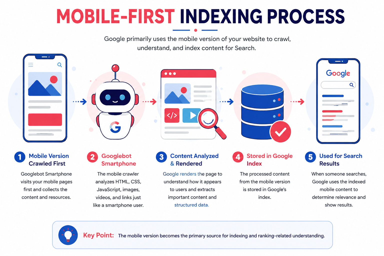
Although the concept sounds technical, the process follows a straightforward sequence.
Step 1: Googlebot Smartphone Visits Your Website
Google primarily uses Googlebot Smartphone to crawl modern websites.
Instead of simulating a desktop browser, it behaves like a smartphone user.
Step 2: Google Crawls the Mobile Version
The crawler analyzes:
- HTML
- CSS
- JavaScript
- Images
- Videos
- Internal links
- Structured data
- Metadata
If these elements are missing or inaccessible, Google may not fully understand the page.
Step 3: Google Renders the Page
Google renders the page to understand how it appears after JavaScript and other resources load.
This step helps Google interpret dynamic content and user-facing elements.
Step 4: Google Indexes the Content
After processing the page, Google stores relevant information in its search index.
The indexed information becomes the foundation for how Google understands the page and determines its relevance to search queries.
Step 5: Search Results Are Generated
When users search for relevant topics, Google retrieves information from its index to determine which pages are most helpful.
The quality and completeness of the mobile version influence what Google understands about the page.
How Googlebot Smartphone Evaluates Your Website
Googlebot Smartphones doesn't just look at text.
It evaluates the overall mobile experience.
This includes:
Content
Is the mobile content complete?
Is important information hidden?
Navigation
Can users easily move between pages?
Are menus accessible?
Internal Links
Can Google discover important pages through mobile navigation?
A strong internal linking structure supports efficient crawling. Learn more in our guide to Search Engine Crawling, where we explain how Google discovers and follows links across a website.
Images
Are images accessible?
Do they include descriptive alt text?
Do they load correctly?
Videos
Can Google access video resources?
Do videos appear on mobile?
Structured Data
Is the same structured data available on mobile and desktop?
Google recommends keeping structured data consistent across both versions.
Important SEO elements should remain consistent, including:
- Title tags
- Meta descriptions
- Robots directives
- Canonical tags
Consistency helps Google interpret pages accurately.
Mobile Usability
Google also evaluates whether your website offers a smooth mobile experience.
For example:
Good mobile experience:
- Responsive layout
- Readable fonts
- Touch-friendly buttons
- Fast loading
- No horizontal scrolling
Poor mobile experience:
- Tiny text
- Broken menus
- Overlapping elements
- Slow pages
- Hidden content
These usability factors contribute to a better overall experience for both users and search engines.
Mobile-First Indexing vs Mobile-Friendly Websites
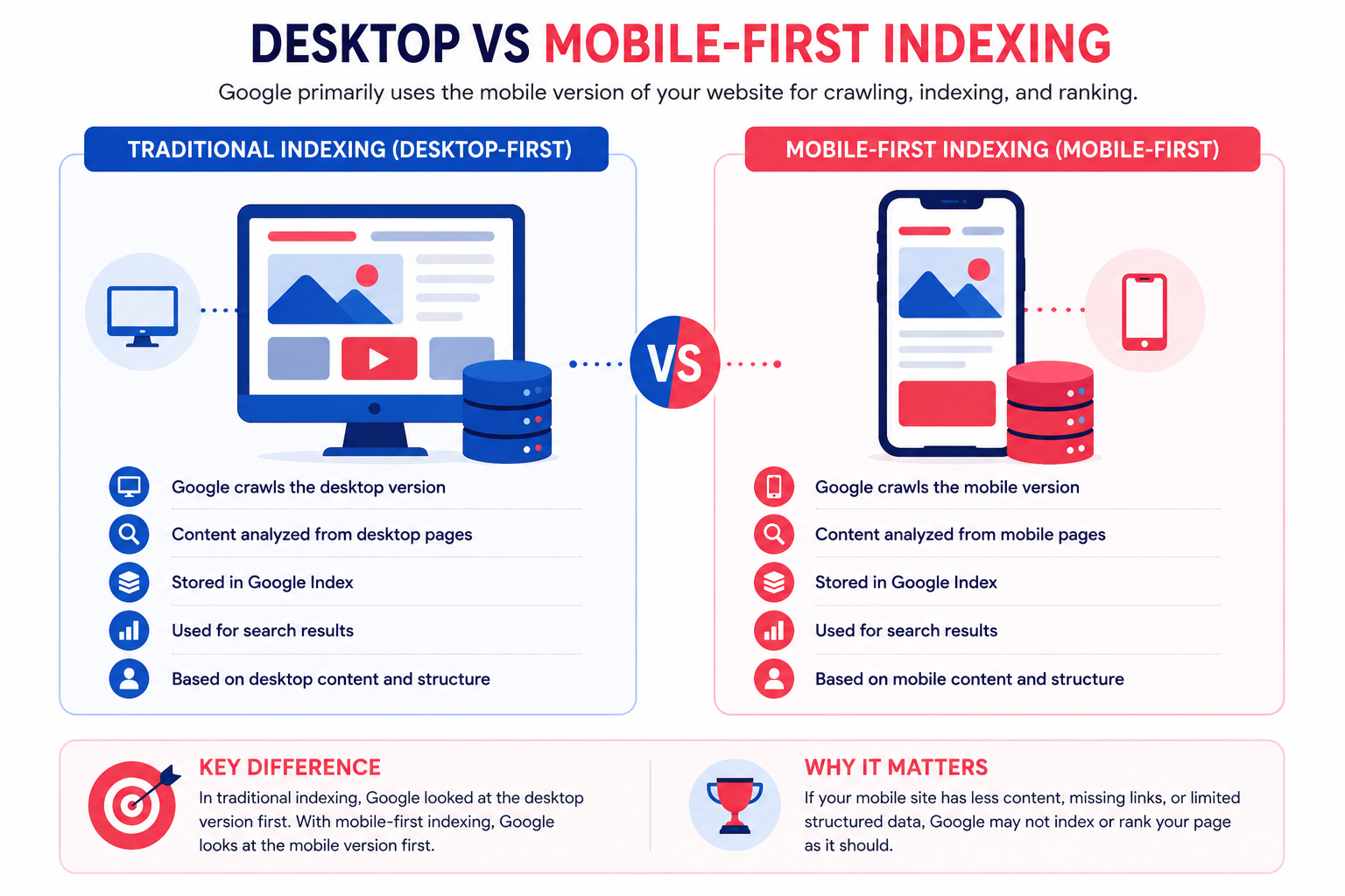
Many website owners use these two terms interchangeably, but they are not the same.
A website can be mobile-friendly without fully supporting Mobile-First Indexing, and it can also have Mobile-First Indexing while still offering a poor mobile experience.
Understanding the difference helps you optimize your website more effectively.
| Mobile-First Indexing |
Mobile-Friendly Website |
| Refers to how Google indexes your website. |
Refers to how users experience your website on mobile devices. |
| Uses the mobile version for crawling and indexing. |
Focuses on usability and responsive design. |
| Controlled by Google's indexing system. |
Controlled by website design and development. |
| Evaluates mobile content consistency. |
Evaluates user experience on mobile devices. |
Example
Imagine two ecommerce websites.
Website A
- Responsive design
- Complete product descriptions
- Same content on desktop and mobile
- Fast loading
- Mobile-friendly navigation
Google has no difficulty understanding this website.
Website B
- Mobile-friendly layout
- Half the content removed on mobile
- Missing FAQs
- Missing structured data
- Product reviews hidden
Although users can browse the website on a phone, Google sees less information during indexing. This is a Mobile-First Indexing problem—not a mobile usability problem.
Mobile-First Indexing vs Responsive Design
Another common misconception is that responsive design and Mobile-First Indexing are the same thing.
They aren't.
Responsive design is a development approach.
Mobile-First Indexing is Google's indexing process.
Google recommends responsive web design because it uses the same HTML, URLs, metadata, and structured data across all devices, making it easier for Googlebot Smartphone to crawl and understand pages consistently.
Responsive Design
One URL.
One HTML version.
The layout automatically adapts to different screen sizes.
Benefits include:
- Easier maintenance
- Better crawl efficiency
- Consistent content
- Fewer indexing issues
Dynamic Serving
Same URL.
Different HTML for desktop and mobile users.
Requires accurate server-side detection.
This setup increases complexity and requires careful testing to ensure both versions provide equivalent content.
Separate Mobile URLs
Example:
Desktop
example.com/blog
Mobile
m.example.com/blog
This older approach is still supported but requires additional technical implementation to keep both versions synchronized.
Why Google Recommends Responsive Design
Responsive websites help maintain consistency across devices.
This means Googlebot Smartphone sees:
- Same headings
- Same content
- Same structured data
- Same metadata
- Same images
- Same internal links
The fewer differences between desktop and mobile, the fewer indexing problems you'll encounter.
Does Mobile-First Indexing Affect Rankings?
This is one of the most misunderstood topics in SEO.
The short answer:
No.
Mobile-First Indexing itself is not a ranking factor.
Instead, it changes which version of your website Google primarily evaluates.
However, Mobile-First Indexing can indirectly influence rankings because your mobile pages affect how Google understands your content.
For example:
A desktop page contains:
- 2,500-word guide
- FAQ section
- Schema markup
- Internal links
- Videos
- Images
The mobile page contains:
- 800 words
- No FAQ
- Missing schema
- Hidden content
Google primarily evaluates the mobile version.
As a result, it has less information available when interpreting the page.
This may reduce the page's relevance for certain search queries.
How Mobile-First Indexing Impacts Different Website Types
Every website benefits differently from Mobile-First Indexing.
Ecommerce Websites
Online stores often contain:
- Product pages
- Reviews
- Specifications
- Images
- Videos
- Buying guides
If mobile pages hide reviews or product details, Google may miss valuable information.
SaaS Websites
Software companies rely heavily on:
- Landing pages
- Feature comparisons
- Pricing
- Case studies
Keeping these sections consistent across devices helps Google understand the product offering.
Local Business Websites
Many local searches occur on smartphones.
Examples include:
- Restaurants
- Dentists
- Lawyers
- Plumbers
- Marketing agencies
A mobile-optimized website improves both usability and Google's ability to understand local business information.
Businesses looking to improve mobile usability, technical SEO, and search visibility can also explore our best seo services in USA to build websites optimized for Google's mobile-first search experience.
Is Your Website Ready for Mobile-First Indexing?
Improve your mobile experience, technical SEO, Core Web Vitals, and search visibility with our professional SEO services tailored for businesses across the USA.
Blogs
Content-heavy websites should ensure:
- Full articles appear on mobile.
- Internal links remain accessible.
- Images load correctly.
- Tables remain readable.
Removing sections simply to shorten mobile pages often creates indexing issues.
Common Mobile-First Indexing Problems
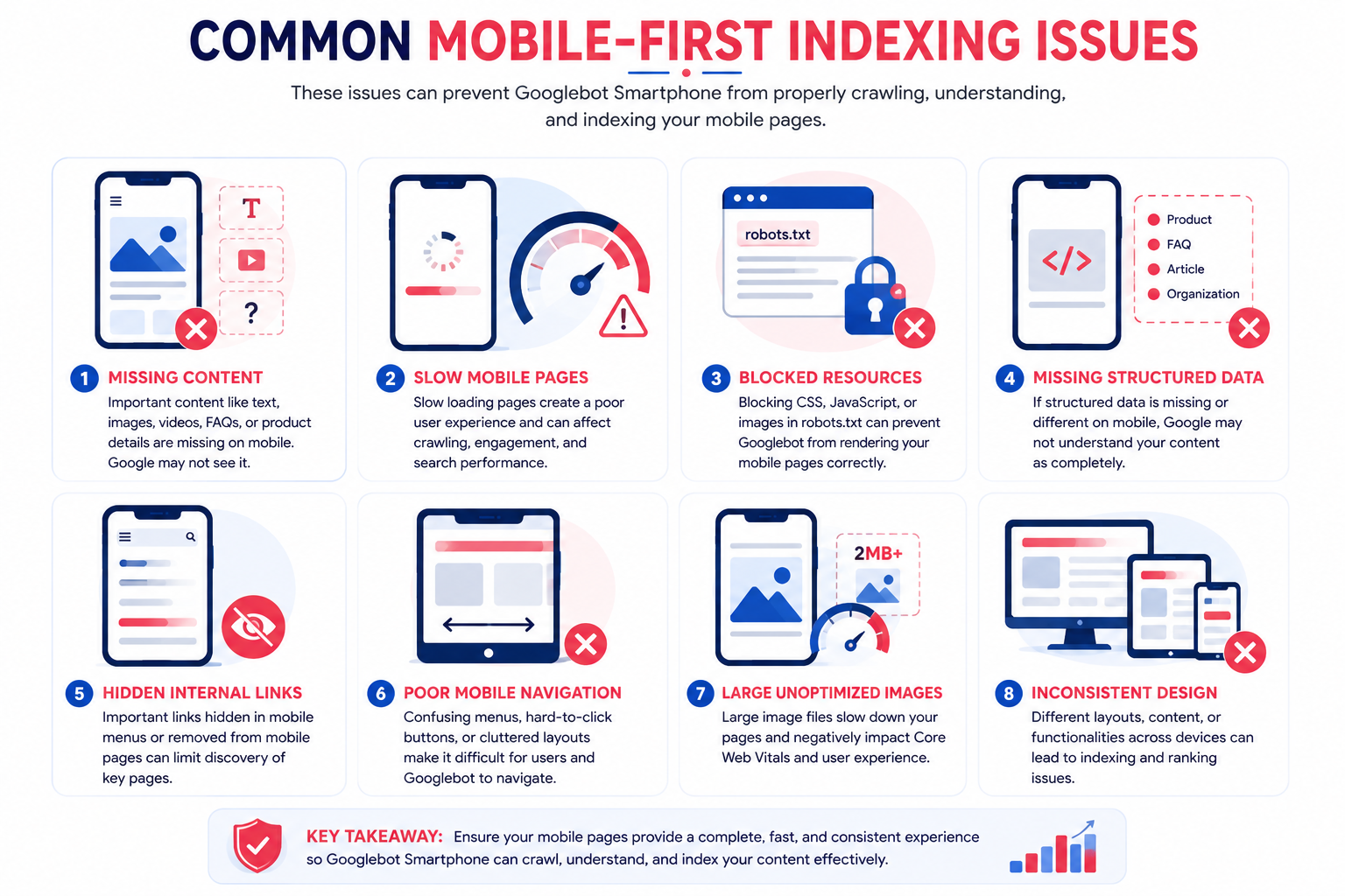
Many websites unknowingly create differences between desktop and mobile pages.
Let's look at the most common issues.
Missing Content
One of the biggest mistakes is removing important content from mobile pages.
Examples include:
- FAQs
- Product specifications
- Customer reviews
- Internal links
- Comparison tables
If users can only access this information on desktop, Google may not use it when indexing the page.
Hidden Internal Links
Navigation often changes significantly on mobile.
Sometimes developers remove links to:
- Categories
- Related pages
- Service pages
This makes it harder for Googlebot Smartphones to discover important pages.
Strong internal linking remains an essential part of crawlability.
Our guide on Website Architecture explains how a logical site structure supports better crawling across both desktop and mobile versions.
Slow Mobile Pages
Page speed affects user experience.
Common causes include:
- Large images
- Heavy JavaScript
- Multiple CSS files
- Third-party scripts
- Poor hosting
While Mobile-First Indexing itself isn't about speed, slow mobile pages reduce usability and engagement.
To improve performance, focus on Core Web Vitals, which measure loading speed, responsiveness, and visual stability.
Inconsistent Structured Data
Google recommends keeping structured data consistent across desktop and mobile pages.
Missing Product, FAQ, Organization, or Article schema on mobile can reduce the information available to Google.
Learn more in our guide on Structured Data and how it improves search understanding.
Ensure mobile pages include:
- Title tag
- Meta description
- Robots directives
- Canonical tag
Metadata should remain consistent whenever possible.
Blocked Resources
Googlebot Smartphone must access:
Blocking these resources can prevent Google from rendering pages correctly.
Your robots.txt configuration should allow important assets to be crawled.
Mobile-First Indexing Best Practices
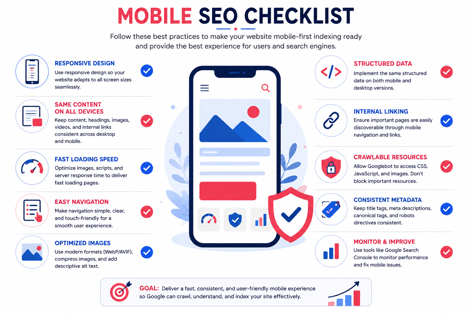
Following Google's recommendations helps ensure your website is fully prepared.
Keep Desktop and Mobile Content Consistent
Avoid removing:
- Headings
- Images
- Videos
- FAQs
- Tables
- Internal links
Users and search engines should access the same valuable information regardless of device.
Use Responsive Design
Responsive websites reduce maintenance while ensuring consistent indexing across devices.
Optimize Mobile Navigation
Your mobile menu should make important pages easy to discover.
Avoid hiding key service pages behind complicated navigation.
Improve Mobile Page Speed
Focus on:
- Image compression
- Browser caching
- Minified CSS
- Minified JavaScript
- Fast hosting
- Lazy loading (implemented correctly)
If you're using lazy loading, make sure important images remain crawlable. Our Lazy Loading Guide explains how to balance performance with search engine accessibility.
Optimize Images
Large images can slow mobile pages.
Best practices include:
- WebP
- AVIF
- Responsive images
- Descriptive filenames
- Proper alt text
Our Image SEO Guide explains how to optimize images for both users and search engines.
Maintain Structured Data
Structured data should remain identical across desktop and mobile versions.
Google specifically recommends consistency in structured data implementation.
Strengthen Internal Linking
A strong internal linking structure helps Googlebot Smartphone discover more pages during crawling.
Your mobile navigation should include important:
- Categories
- Service pages
- Related blogs
- Pillar pages
This supports better crawl efficiency while improving the user experience.
Mobile-First SEO Checklist
Before publishing new pages, review this checklist.
Content
- Same headings on desktop and mobile
- Same text content
- Same FAQs
- Same images
- Same videos
Technical SEO
- Responsive layout
- Crawlable CSS
- Crawlable JavaScript
- Mobile-friendly navigation
- Structured data
- Canonical tags
- Robots.txt configured correctly
- Fast loading
- Optimized images
- Mobile-friendly fonts
- Touch-friendly buttons
- Stable layout
How to Check If Your Website Uses Mobile-First Indexing
Most modern websites have already been moved to Mobile-First Indexing. However, it's still important to verify that Google is crawling and indexing your site as expected.
Fortunately, you don't need advanced technical skills to check.
Method 1: Google Search Console
Google Search Console is the easiest place to monitor how Google interacts with your website.
Use it to:
- Check indexed pages
- Review crawl activity
- Monitor mobile usability issues
- Identify indexing errors
- Find pages with technical problems
If Google encounters issues with your mobile pages, Search Console is usually the first place where those problems appear.
The URL Inspection Tool allows you to inspect an individual page.
It helps you determine:
- Whether the page is indexed
- When Google last crawled it
- Whether the page is accessible
- If resources are blocked
This is especially useful after making changes to important pages.
Method 3: Test Your Website on Different Mobile Devices
Don't rely on a single smartphone.
Check your website on:
- Android
- iPhone
- Tablets
- Different screen sizes
Look for:
- Broken layouts
- Missing content
- Hidden menus
- Cropped images
- Navigation issues
If users struggle to navigate your website, Googlebot Smartphone may also struggle to process it correctly.
Method 4: Crawl Your Website
Technical SEO tools like Screaming Frog can simulate how search engines crawl your website.
These tools help identify:
- Broken links
- Redirect chains
- Missing metadata
- Duplicate content
- Missing alt text
- Large images
- Crawl depth
Regular crawling helps detect technical issues before they affect indexing.
Mobile-First Indexing Audit Checklist
Before publishing or updating your website, review the following checklist.
Content
- Same content on desktop and mobile
- Same headings
- Same images
- Same videos
- Same FAQs
- Same product descriptions
- Same downloadable resources
Technical SEO
- Responsive design
- Crawlable CSS
- Crawlable JavaScript
- Crawlable images
- Proper robots.txt configuration
- Correct canonical tags
- Structured data on mobile
- Secure HTTPS pages
User Experience
- Easy navigation
- Readable fonts
- Clickable buttons
- Mobile-friendly forms
- Proper spacing
- No horizontal scrolling
- Optimized images
- Fast server response
- Compressed resources
- Browser caching
- Lazy loading configured correctly
- Good Core Web Vitals
Mobile-First Indexing Myths
Many misconceptions still exist about Mobile-First Indexing.
Let's clear up some of the most common ones.
Myth 1: Mobile-First Indexing Is a Ranking Factor
Reality
Mobile-First Indexing changes which version of your website Google primarily indexes. It does not directly increase or decrease rankings.
However, if your mobile version provides a poor experience or contains less information than the desktop version, it can indirectly affect search performance because Google has less content available to understand your pages.
Myth 2: Desktop Websites No Longer Matter
Reality
Desktop websites still matter.
Google primarily indexes the mobile version, but desktop users continue to visit websites, especially in B2B industries and enterprise environments.
The goal is consistency across both versions.
Myth 3: Mobile-Friendly Design Automatically Solves Everything
Reality
A responsive layout alone isn't enough.
Your mobile website also needs:
- Complete content
- Internal links
- Metadata
- Structured data
- Optimized images
- Fast performance
Myth 4: Hidden Mobile Content Always Hurts SEO
Reality
Responsive design often hides content for better usability without removing it from the HTML.
Problems occur when important content exists only on the desktop version and is completely missing from mobile pages.
Common Mobile-First Indexing Mistakes
Even experienced website owners make these mistakes.
Removing Important Content
Some websites shorten mobile pages by removing:
- FAQs
- Product details
- Comparison tables
- Reviews
- Internal links
This reduces the information available to Google.
Using Different Structured Data
Desktop includes:
- FAQ Schema
- Product Schema
- Article Schema
Mobile includes none.
Google recommends keeping structured data consistent across both versions.
Poor Mobile Navigation
If users cannot reach important pages through mobile navigation, Googlebot Smartphones may also have difficulty discovering them.
A well-planned Internal Site Architecture helps ensure every important page remains accessible.
Ignoring Mobile Images
Large images can:
- Slow page speed
- Increase bounce rate
- Affect Core Web Vitals
Optimize images using:
- WebP
- AVIF
- Compression
- Proper dimensions
- Alt text
Blocking Googlebot
Sometimes developers accidentally block:
through robots.txt.
Googlebot Smartphone needs access to these resources to render pages correctly.
Mobile-First Indexing and Technical SEO
Mobile-First Indexing isn't a standalone SEO task.
It works alongside many technical SEO components.
These include:
- Website Architecture
- Internal Site Architecture
- Search Engine Crawling
- Website Indexing
- Crawl Budget
- Crawl Depth
- Robots.txt
- XML Sitemap
- HTML Sitemap
- Image Sitemap
- Structured Data
- Schema Markup
- Canonical Tags
- Lazy Loading
- Core Web Vitals
When these elements work together, Google can crawl, understand, and index your mobile website more efficiently.
Why Mobile-First Indexing Matters for Businesses
Whether you run:
- A local business
- An ecommerce store
- A SaaS platform
- A B2B company
- A content website
your customers are increasingly accessing your website from mobile devices.
An optimized mobile experience supports:
- Better user engagement
- Higher crawl efficiency
- Improved search visibility
- Easier content discovery
- More qualified organic traffic
Mobile optimization is no longer optional—it's a fundamental part of modern SEO.
Conclusion
Mobile-First Indexing reflects the way people use the web today. Rather than evaluating desktop pages first, Google primarily relies on the mobile version of your website to crawl, understand, and index content. This doesn't mean you need a separate mobile website. Instead, your goal should be to provide a consistent, responsive experience where the same valuable content, metadata, structured data, internal links, and media are available across all devices. By combining responsive design, strong technical SEO, fast loading pages, optimized images, and logical website architecture, you make it easier for Googlebot Smartphone to understand your website while delivering a better experience for users. As mobile usage continues to grow, investing in Mobile-First Indexing best practices helps build a stronger foundation for sustainable organic visibility.
If your business operates in the UK and wants to improve mobile performance, crawlability, and technical SEO, discover how our seo service in the UK helps organizations build websites that perform better in Google's mobile-first search environment.
Build a faster, mobile-friendly website with technical SEO strategies designed to improve crawlability, indexing, and organic visibility for businesses across the UK.